
Re-design of Neo Africa's Corporate Identity
Revolutinising the philosophy of change
Revolutinising the philosophy of change
I was employed at Neo Africa due to an immediate and urgent need for creative leadership and management of their corporate identity during their national sponsorship of the 2010 FIFA World Cup South Africa.
I had to refresh their corporate identity in time for the release of marketing and creative material for Neo Africa's presence at the Final Draw of the 2010 FIFA World Cup.
Within a short period of time I retouched their CI, smoothly integrated about 10 brands under one corporate umbrella, design and oversaw the production of corporate stationery, brochures and advertisements, design and directed the set-up of a bright new website, an animated logo loop for TV and an exhibition stand, oversaw the set-up of the exhibition stand on site and presented our company at the stand.
Logos for holding company, sub-divisions and group of companies

Full colour logo
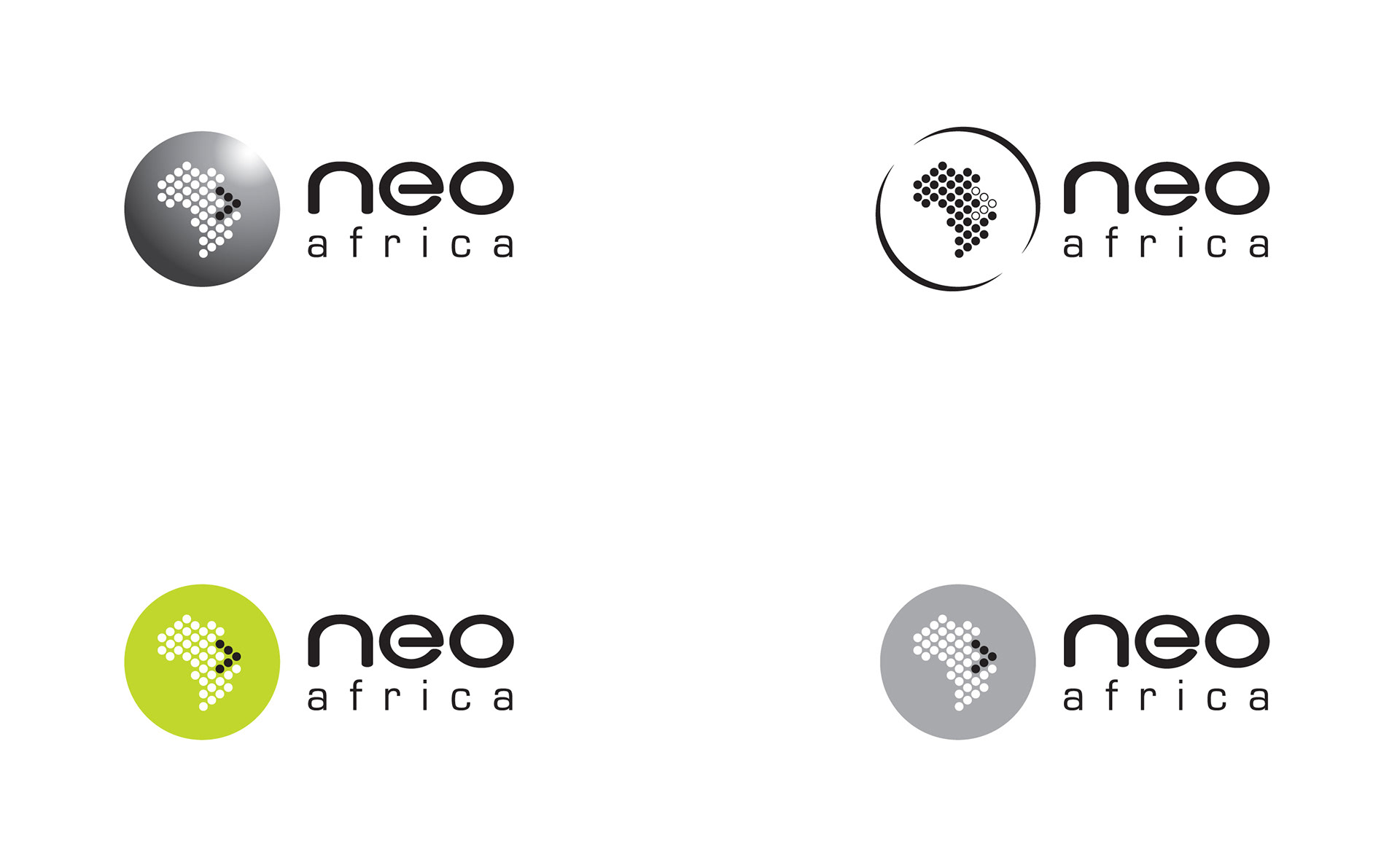
Variations for different applications
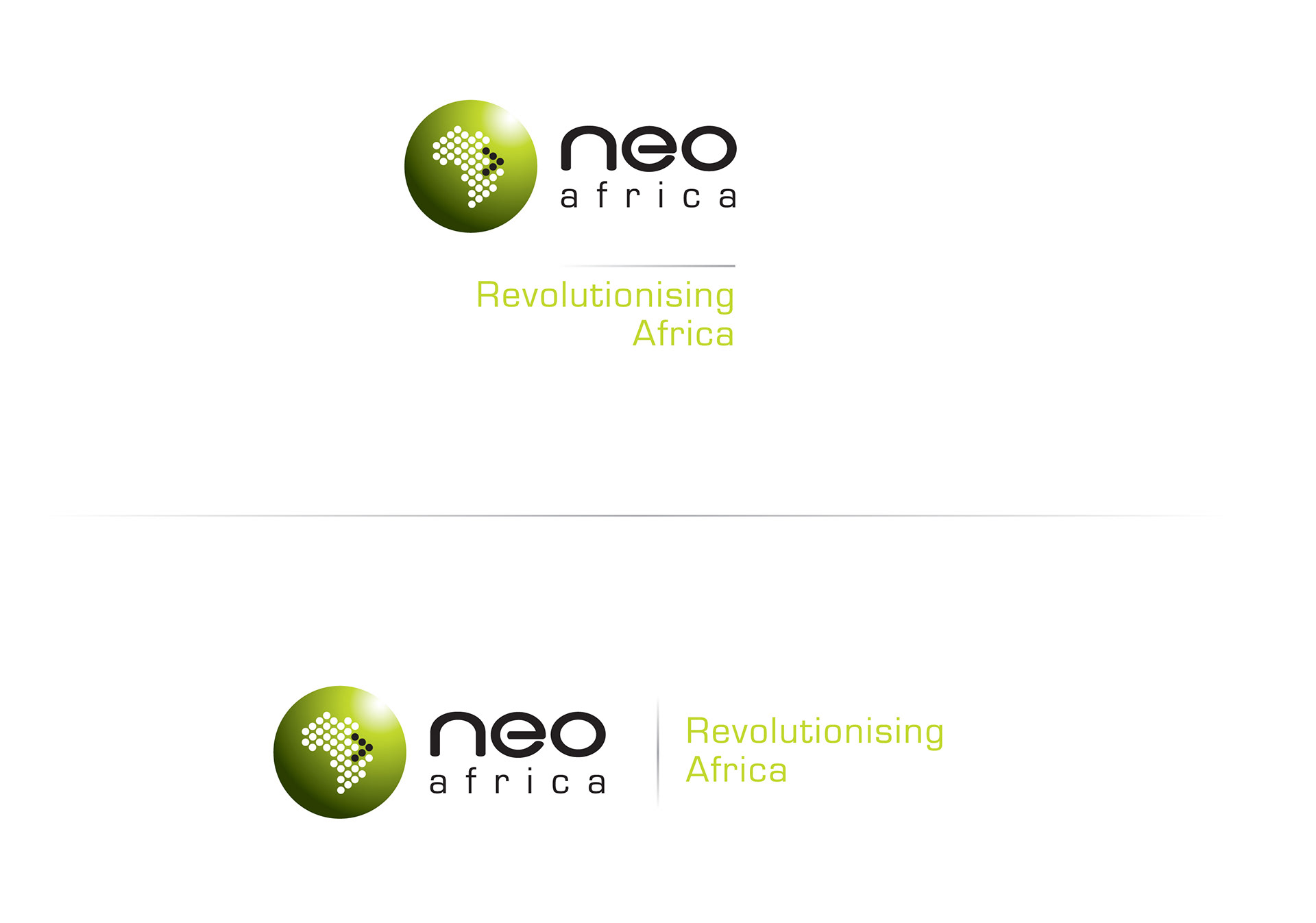
Main logo with tagline
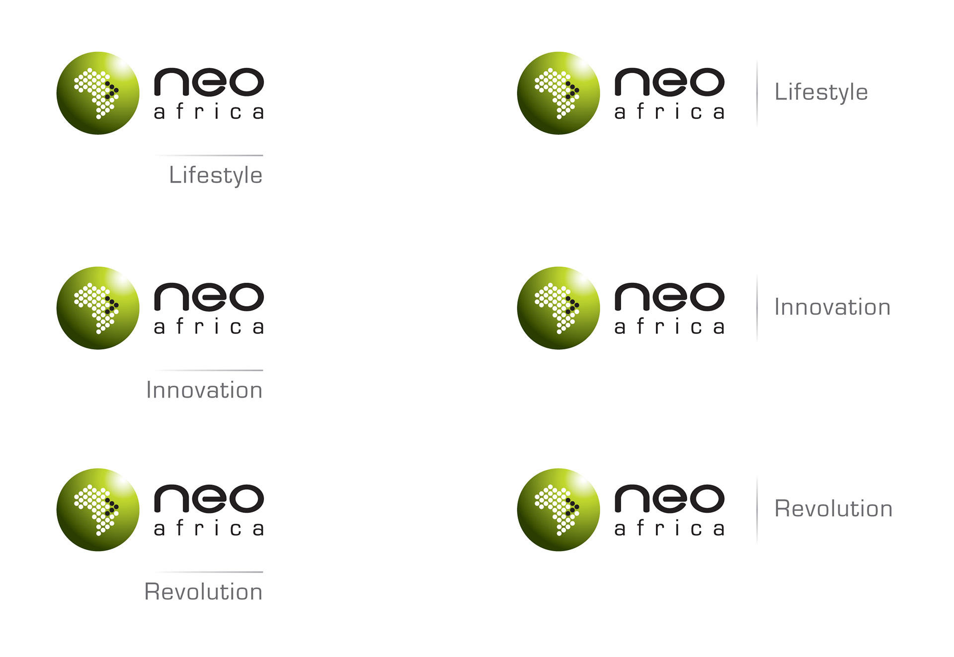
Logos for sub-divisions
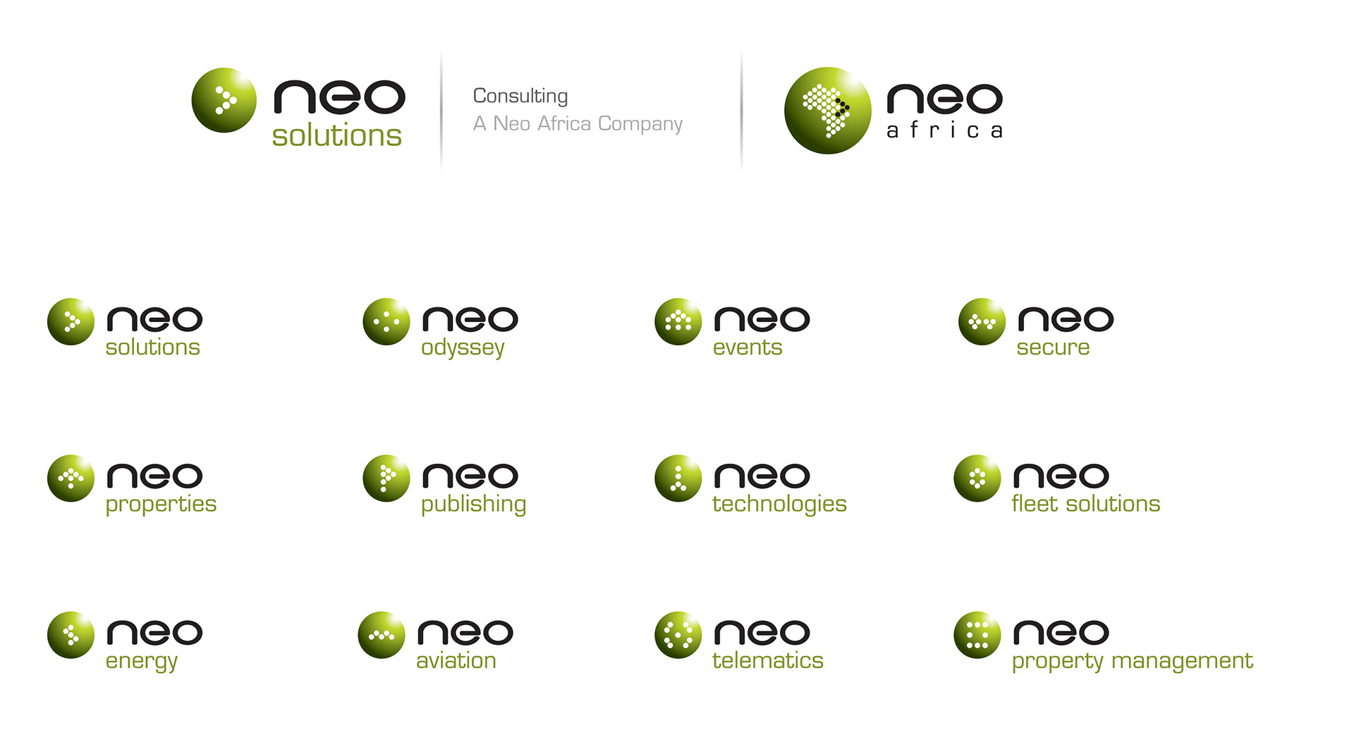
Logos and icons for various sub-companies including composite logo with logo of holding company (above)
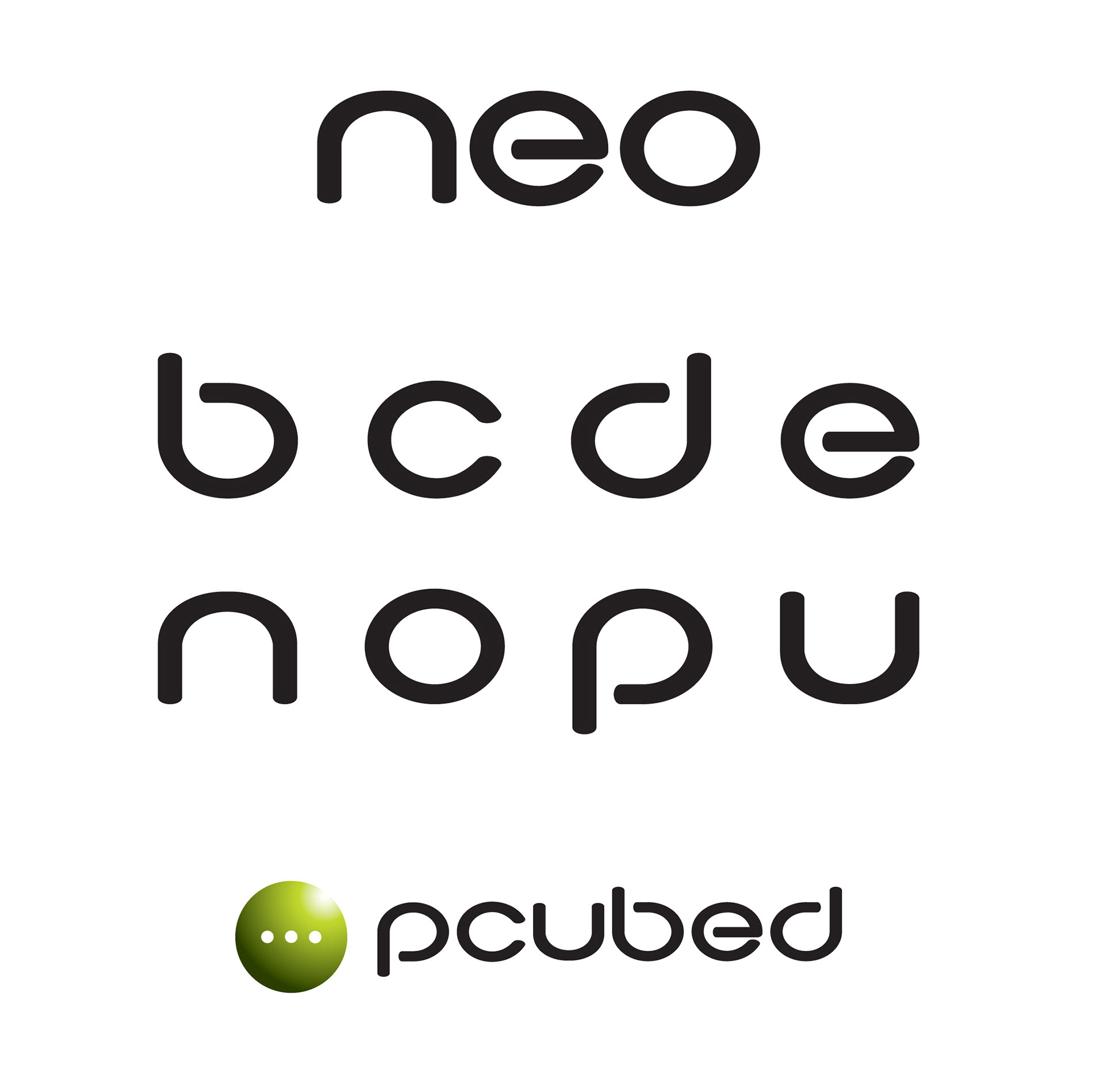
Neo Africa typeface - extended from the original "neo"
Stationary and Corporate Collateral
Stationery was developed for each company that reflects its connection with the holding company.
To add more life and depth to their sold black look and feel without compromising the black identity that has already been established, I added a green "stream of light" illumination. This excites me, as the "stream of light" gave the feel of outer space in which this green globe finds its existence and purpose. The "stream of light" also speaks of change and reformation.
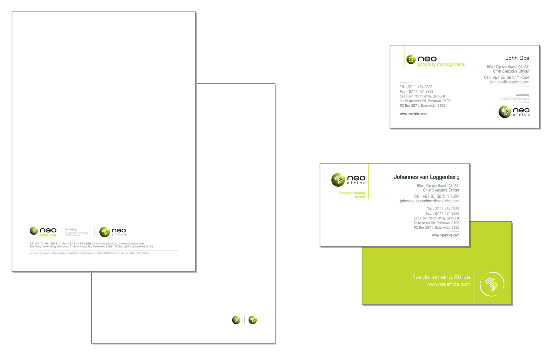
Letterheads, continuations sheets and business cards
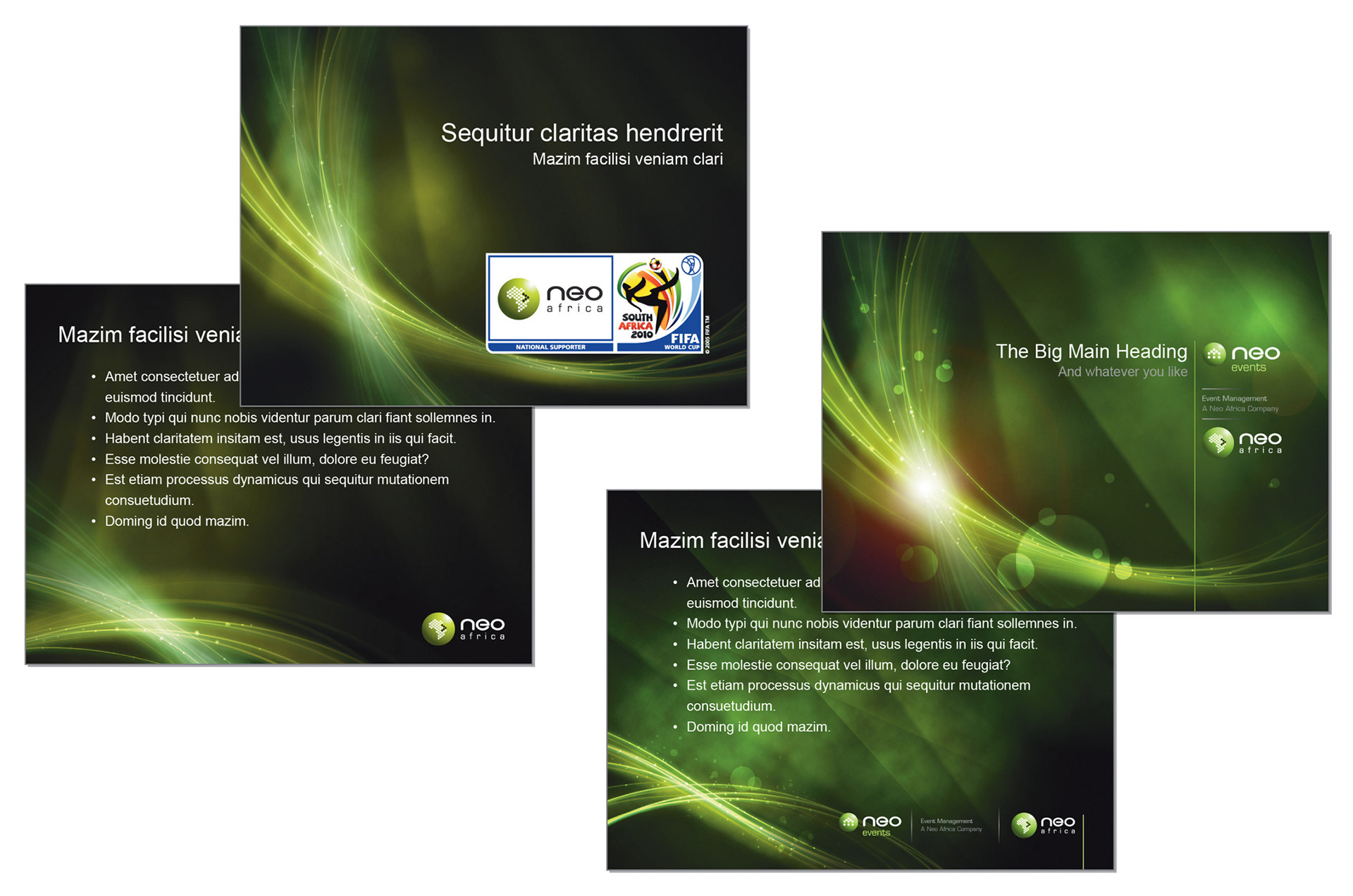
Powerpoint templates: cover sheet and slide sheet
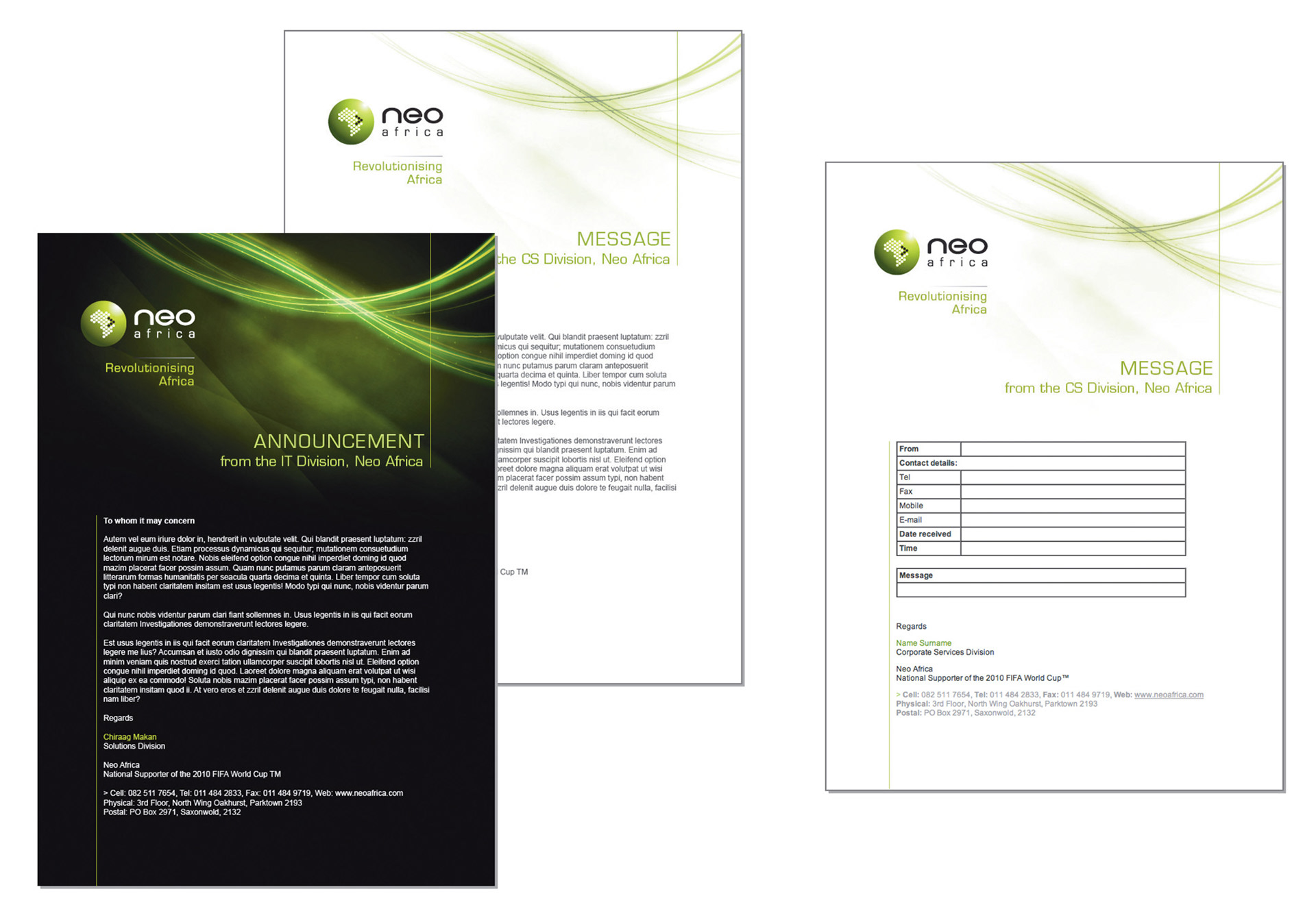
Templates for e-mail correspondence
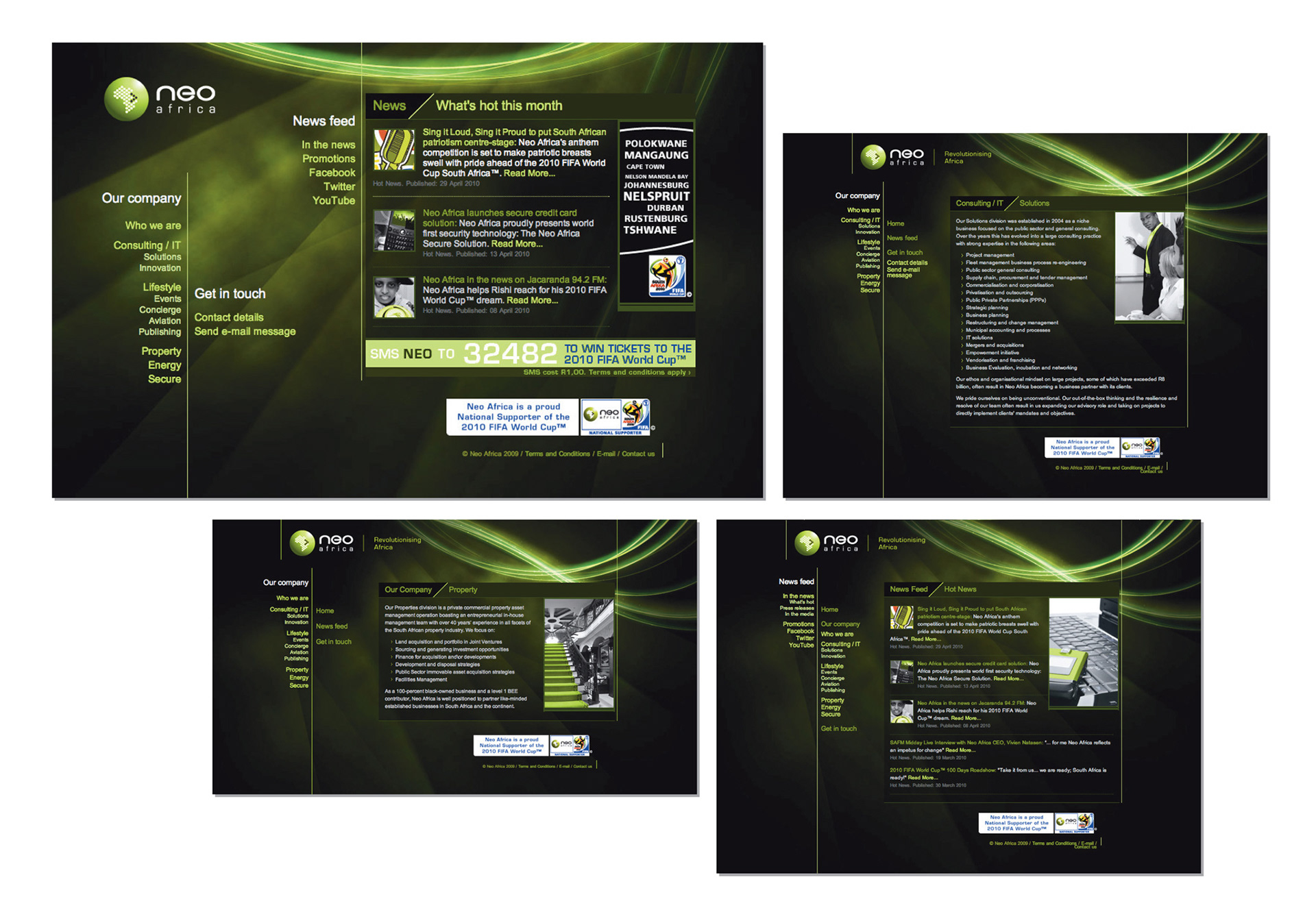
Website - see www.neoafrica.com
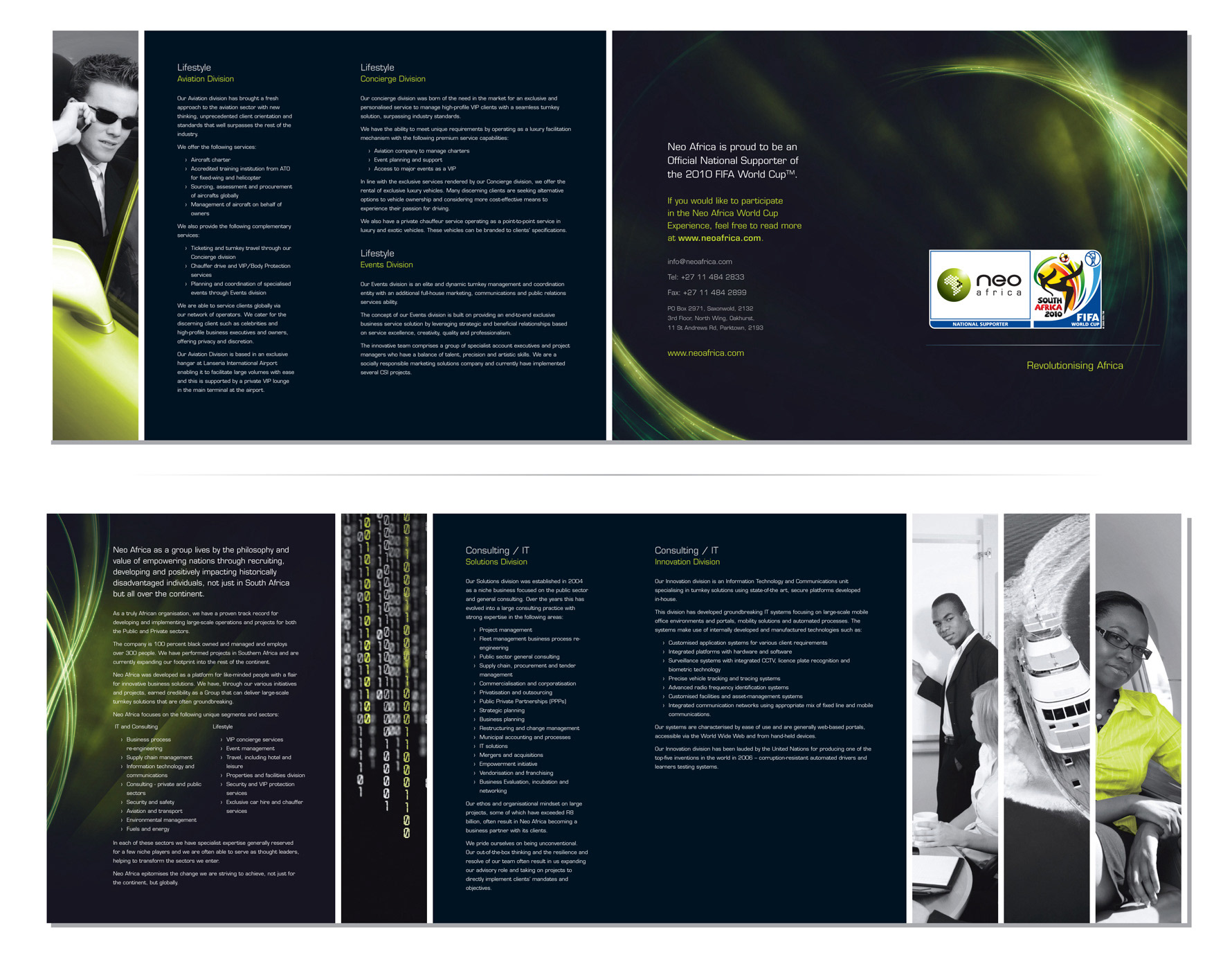
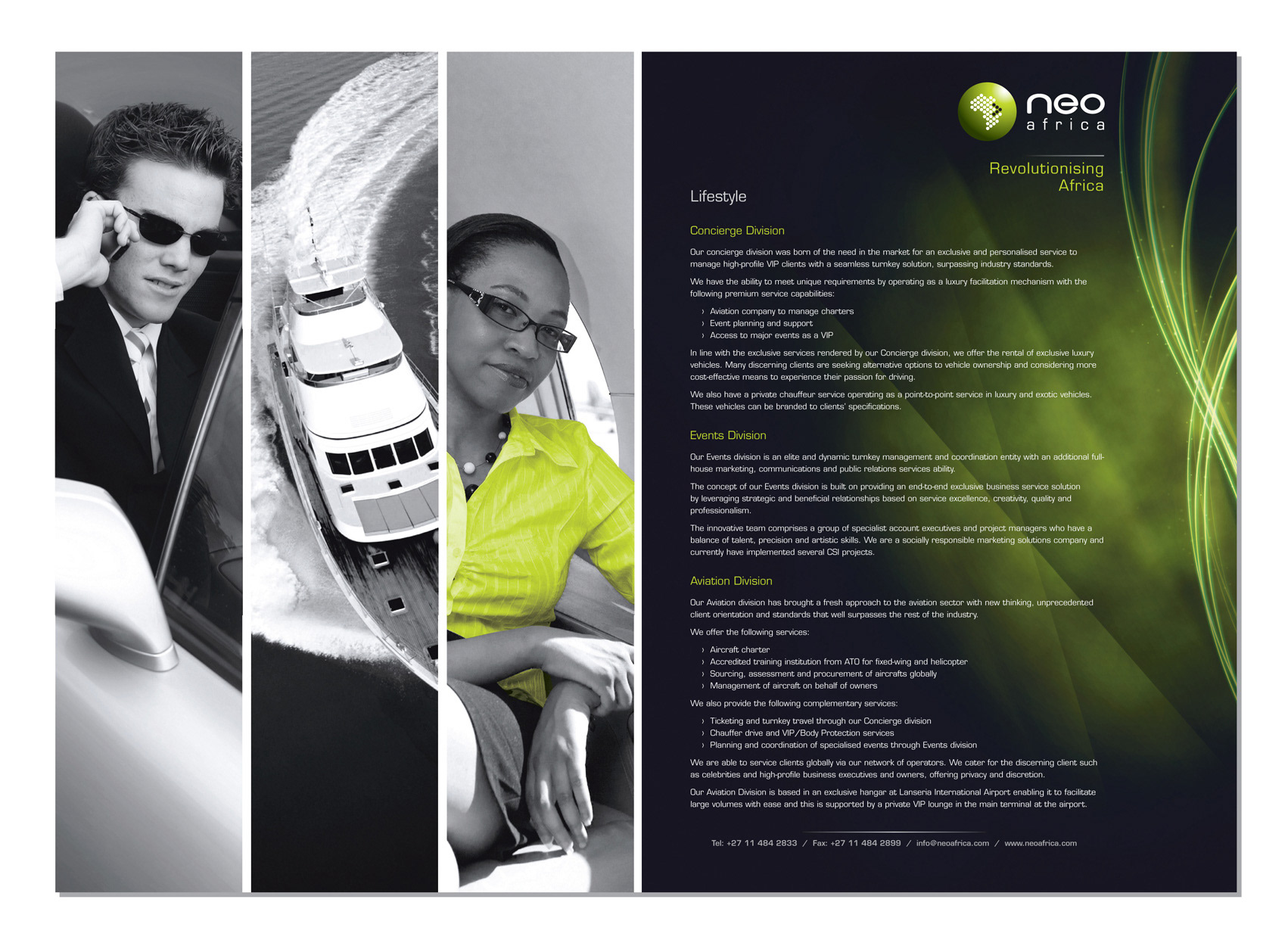
Roll fold brochure
DPS advert
Various adverts
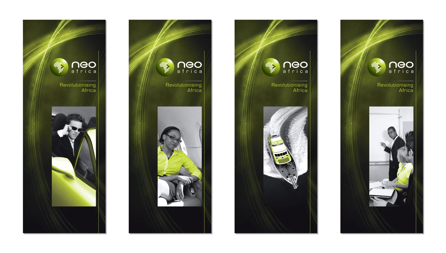
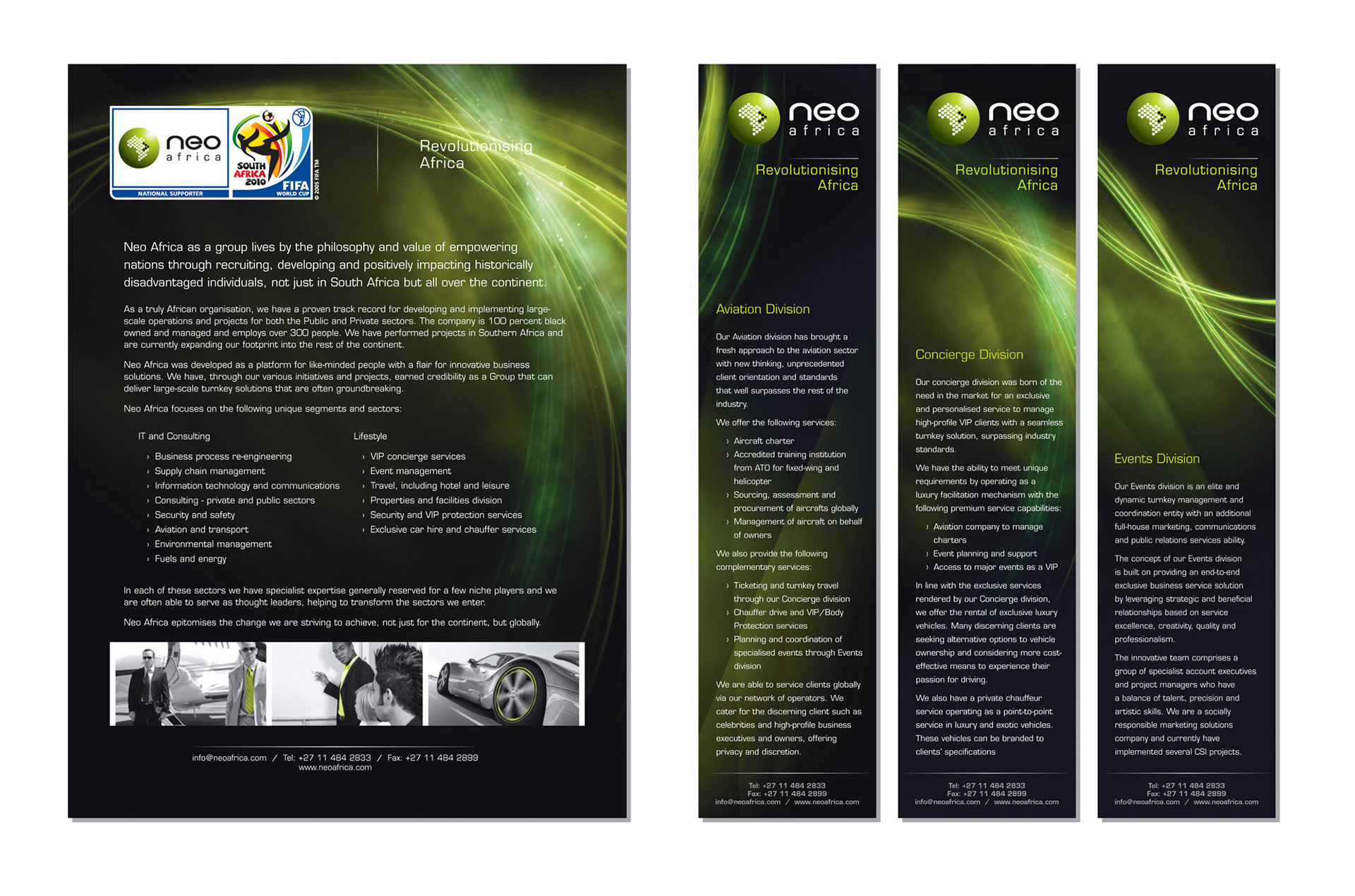
Pull-up banners
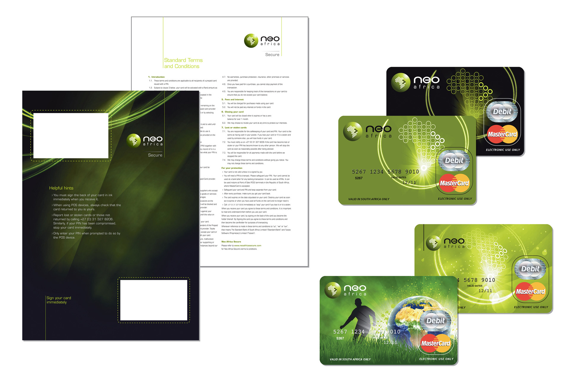
Card design (Travel and Master Card) and PIN Mailer